
Learn
Trauma education & TCCC fundamentals
60%
CONTINUE
Tourniquet Application
3 of 5 lessons complete
Featured
Fundamentals
A trauma response iOS app built around the IFAK kit, teaching civilians and first responders to act with speed and confidence in life-threatening emergencies.

User presses
emergency button.
They will instantly be
connected to dispatch through audio.
Through voice recognition, the user will be sent steps based off the specific scenario and kit to administer early first aid.


Saves automatically, providing evidence & information of the situation.
Allowing dispatch to monitor user,
professionals en route are updated every step of the way.
Every screen of the original concept, designed at high fidelity.
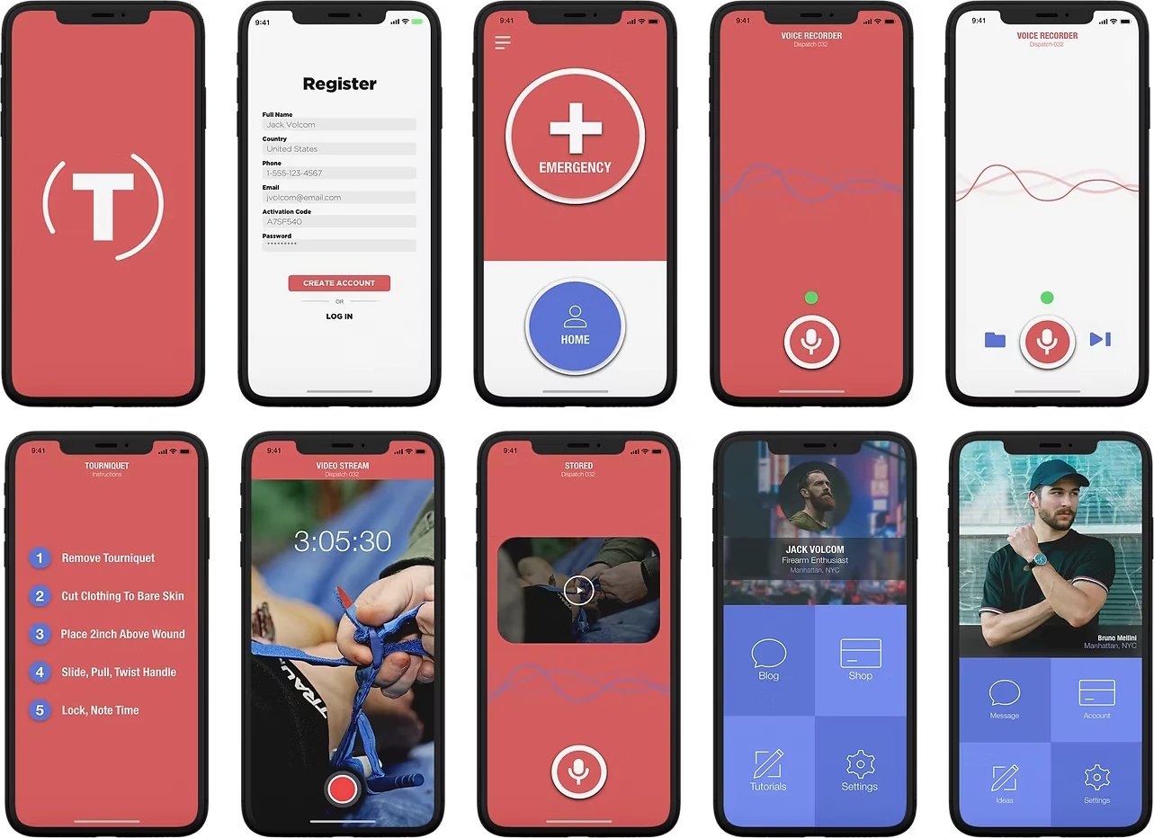
To reduce cognitive load in high-stress scenarios, I extended the solution beyond the app into a physical trauma kit. In emergency situations, relying solely on a mobile interface introduces risk, limited access, time pressure, and user stress can all impact decision‑making.
The kit was designed to act as a physical counterpart to the app, enabling users to follow critical steps quickly without needing to navigate a screen.


Introduced physical redundancy to reduce reliance on mobile devices in time-critical situations.
Aligned kit structure with app flow to create a consistent mental model across digital and physical touchpoints.
Simplified labeling and layout to minimize hesitation and support fast action under pressure.
By pairing a digital interface with a physical system, the solution becomes more resilient in real-world conditions, supporting users whether or not they can access the app in the moment it matters most.
Completed a Stop the Bleed course after a school incident. Owns a basic IFAK. Rarely reviews it. Freezes under stress and can't remember exact steps.
Personal trainer and competitive shooter. Carries IFAK daily. Has TCCC training. Wants fast access to reference without friction: something he can use mid-incident, not study beforehand.
Under acute stress, cognitive load spikes and memory degrades. A sequential checklist offloads working memory and lets the user act, not think. This became the core interaction model for emergency procedures.
Users know what a tourniquet is. They don't know how it connects to the MARCH protocol, or when to pack a wound vs. tourniquet. Cross-linking kit items to procedures bridges this gap in-context.
Neither persona has time for a course between tasks. Short, in-app reads (3–5 min) with zero navigation overhead enable learning in bus rides, waiting rooms, and lunch breaks. The accordion pattern on Learn serves this.
An affinity mapping session across multiple user interviews surfaced five core categories of insight, each one shaping a direct design decision in the app.

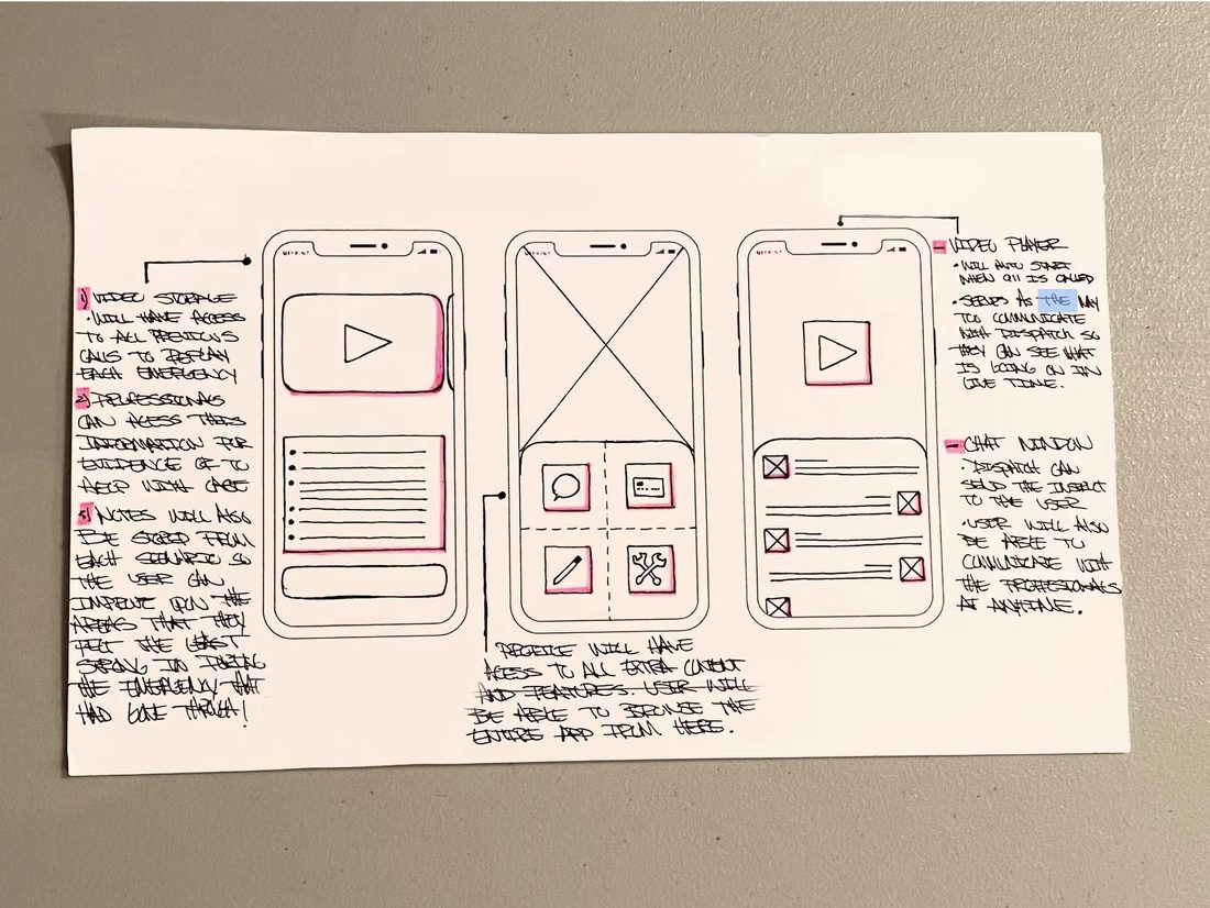
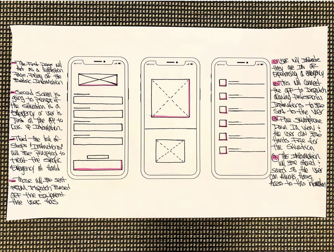
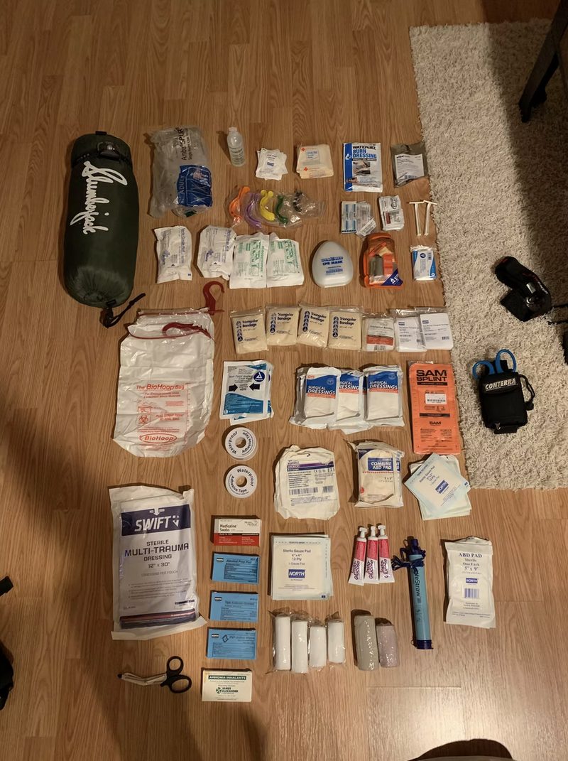
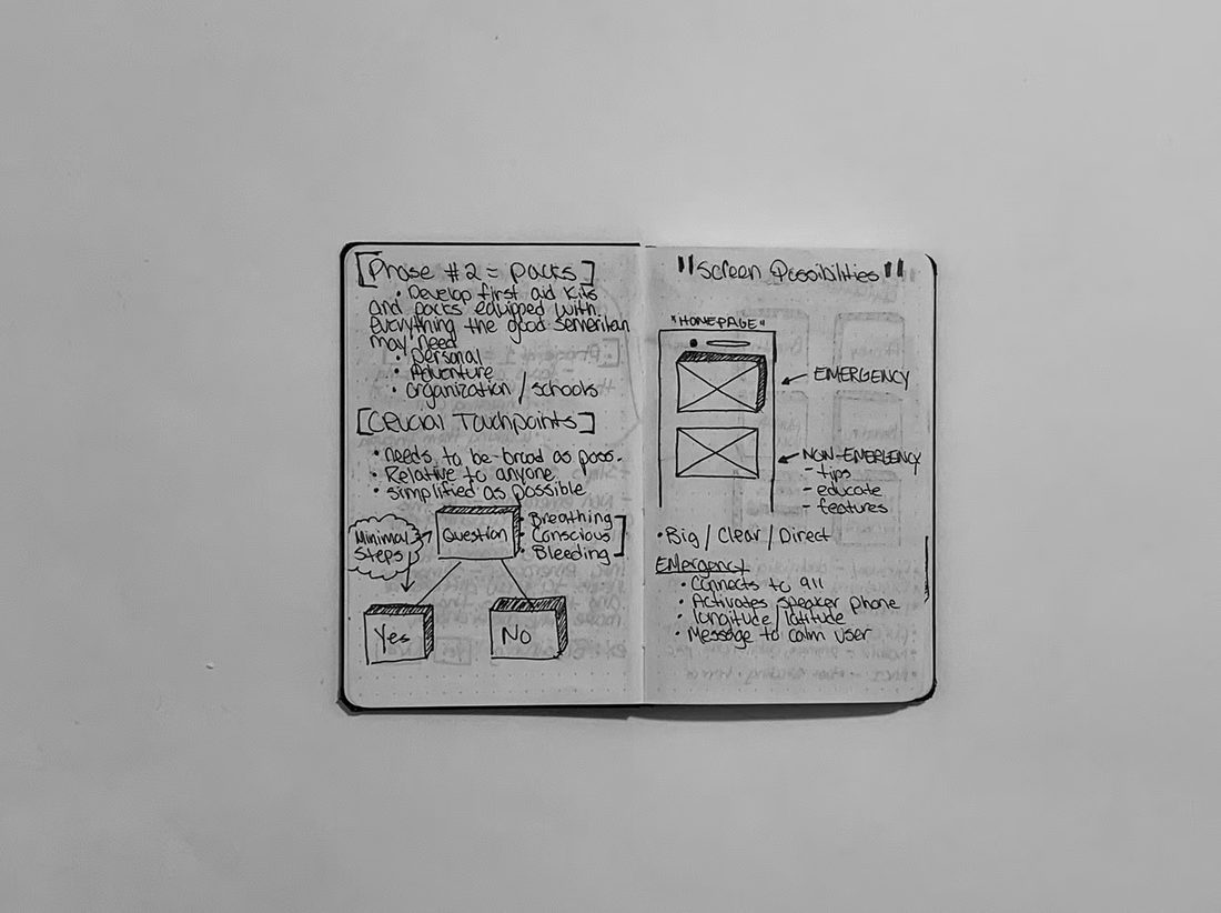
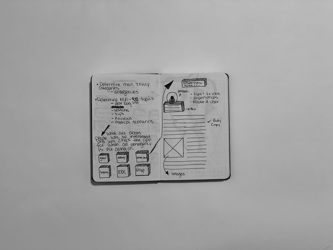
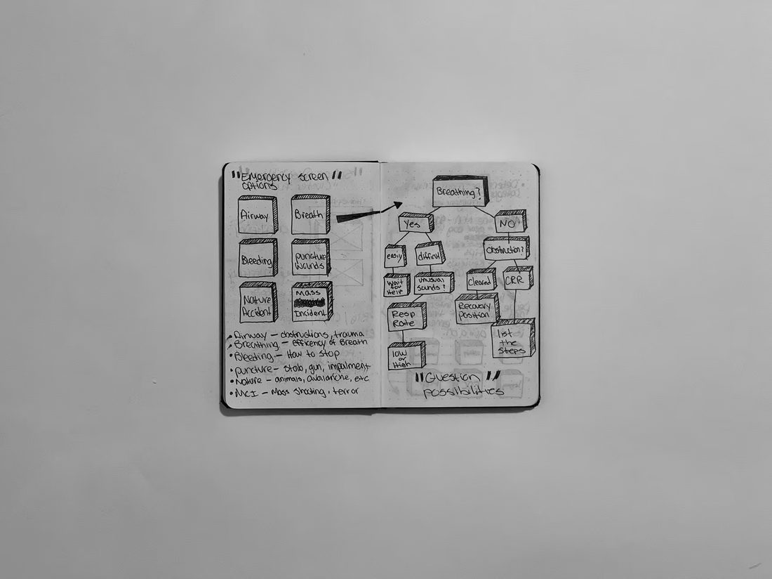
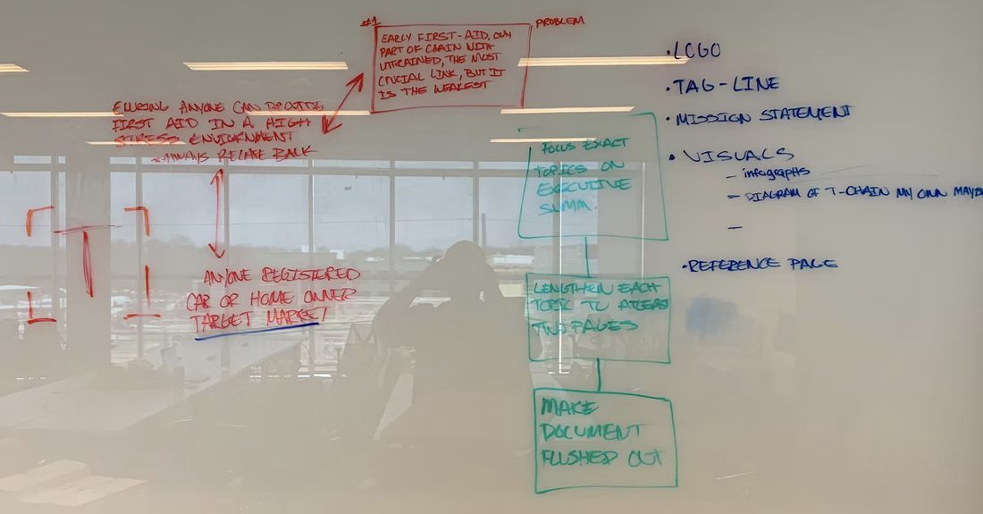
Paper first: sketches, notebooks, whiteboards, and a full kit teardown, before a single pixel. Click any photo to enlarge.
Trauma took 2nd place out of 95 teams in the 2019 Kean University Business Plan Competition, pitched with the app, the kit, and the business behind them.
The 2019 prototype established the core concept. The 2025 rebuild retains that DNA while adding MARCH protocols, IFAK education, and a stress-optimized interaction model. Open it if you want the full redesign story.
Millions of people own IFAKs (Individual First Aid Kits), but freeze when it matters most. Equipment without practice is dead weight. The gap between owning a kit and being able to use it under stress is enormous, and almost no one closes it.
Average time before death from severe arterial bleeding, with no intervention
Of preventable combat deaths were from hemorrhage, controlled by a tourniquet
Standardized civilian apps exist that tie IFAK contents to step-by-step emergency protocols
The 2019 prototype established the core concept, an emergency-first trauma app with real-time tools. The 2025 rebuild retains that DNA while adding MARCH protocols, IFAK education, and a stress-optimized interaction model.


Every critical action is 2–3 taps from any screen. The emergency banner is the largest, most prominent element on the home screen. No one should hunt for a procedure mid-emergency.
All interactive elements meet the 44×44pt minimum touch target. High contrast red/white on black for outdoor readability in direct sunlight and low-light environments.
All data is local and static. No API calls, no loading states, no spinners on the critical path. In a trauma scenario, a loading screen is not acceptable.
Overview → How to Use → Critical Notes. Each tab serves a different mental model. Novices start at Overview. Experts jump to Critical Notes for last-minute reminders.
Step-by-step checklists replace memory. Under acute stress, recall degrades. The app thinks for you so you can act. Completed steps dim. Active step highlights. One thing at a time.
Kit items link to procedures. Procedures link back to kit items. The system teaches how the pieces relate, and that connection is what builds real competence over time.
Quick-access overview. Emergency banner front and center. Kit preview and protocol cards.
All 6 IFAK items. Filter by category. Deep-dive into each item: overview, how-to, critical notes.
Emergency protocols sorted by severity. Step-by-step interactive checklists with MARCH framework.
TCCC education. MARCH protocol, shock recognition, tourniquet myths, IFAK building guide.
2–3 taps from app open to first actionable step. Zero friction on the critical path.
Every screen is built around a single question: what does a person in a high-stress emergency actually need right now?
Each screen answers one question: what does this person need right now? Here's the thinking behind every decision.
The home screen is built around a single hierarchy: the emergency button comes first, everything else second. A user in crisis should never have to hunt for an entry point.
A browsable reference for all six IFAK items. Designed for two modes: quick scanning before an event, and deliberate learning between emergencies.
Three tabs. Three mental models. A first-time user reads the Overview. An experienced responder jumps to Critical Notes. A student drilling technique stays on How to Use.
The most critical screen in the app. Every element is there to reduce cognitive load in the worst possible moment. Anything that was only there to look good got cut.
Between emergencies, users need to build competence, not take a course. The Learn screen is designed for micro-learning: one topic, five minutes, real knowledge gained.
Each IFAK item is fully documented with three layers of information, matching novice to expert mental models.
Stop life-threatening limb bleeding. Apply within 2–3 minutes. The #1 life-saving device in a kit.
Control non-limb wound bleeding. Torso, head, neck, groin. Secondary dressing after packing.
Pack deep junctional wounds. Kaolin-impregnated gauze accelerates clotting where a tourniquet can't reach.
Treat penetrating chest wounds. Vented design prevents tension pneumothorax. Seal entry and exit wounds.
Maintain airway in unconscious patients. Nasopharyngeal airway inserted nasally, safer than OPA in trauma.
Access wounds fast, protect yourself. Gloves first. Shears expose injuries without moving the patient.
Every improvement maps back to a research finding. Nothing was changed for aesthetics alone, each decision was grounded in what users said they needed.
Flat list structure with no clear information hierarchy. Emergency response buried among general content.
4-tab structure aligned to the MARCH protocol: Home, Kit, Respond, Learn. Each tab has one clear job.
Emergency action hidden in a list. 4–5 taps to reach a protocol. No visual urgency on the home screen.
Large central red "+" button, the primary visual of the home screen. 2 taps to first actionable step from any screen.
No in-app kit reference. Users had to leave the app and search YouTube or Google to understand how to use their equipment.
Full IFAK reference with 6 items, category filters, and a 3-tab detail view. Overview, step-by-step, and critical notes, all offline.
2019 original had a timer, but no automatic start, no application time recording, and no warnings for dangerous time thresholds.
Auto-starts on the tourniquet step. Records exact application time. Amber at 1hr, red at 2hrs. Confirms the application time for EMS handoff.
No education layer. App was purely reactive, useful in an emergency, useless between them. No path for users to build confidence over time.
Dedicated Learn tab with 4 TCCC articles. Accordion pattern for micro-learning in 3–5 minutes. Designed for the gap between emergencies.
Standard touch targets, no contrast optimization, no consideration for glove use or outdoor visibility. Designed for normal conditions.
44pt minimum touch targets. Black background with red/white for outdoor contrast. All data local, zero loading states on any emergency screen.
The hardest moment to apply a tourniquet is the first time you do it on a real person. Connect adds a direct line to certified trauma instructors, live video coaching during an emergency, and scheduled training sessions to build confidence before one happens.
While steps are in progress, a single "Get Live Help" tap initiates a match. The system pre-loads your active procedure and kit contents, so the coach arrives informed, not cold.
The coach sees exactly what you're working on. Your step checklist floats above the video, they guide verbally, you execute and mark steps complete. The overlay is collapsible so they can see the full injury site.
Live coaching is a supplement, not a replacement. If no coach is available, the 911 option is the largest button on the screen, red, prominent, and impossible to miss under stress.
The 911 button was deliberately made larger and more prominent than the coaching alternatives. We audited every state where the app could slow someone down from calling for professional help, and this screen was the highest-risk moment.
The "Get Live Help" button is pinned to the bottom of every active procedure screen, never more than one tap away while steps are in progress. It never blocks the procedure steps.
The step overlay persists during the video call. The coach guides verbally while the user follows the checklist, they work together, not against each other. The overlay is collapsible so the coach can see the injury.
Emergencies happen at night, outdoors, in low light. That's why the flashlight sits with the primary call controls. A coach can't help if they can't see the wound.
If no coach is available, the 911 option is the biggest, most prominent button. The live coaching feature supplements emergency response, it never replaces or delays calling for professional help.
The post-incident debrief CTA only surfaces when a procedure reaches 100% completion. It never appears mid-emergency, never interrupts the flow. After the moment of need has passed, then we ask.
The Quick Question feature defaults to voice recording, not text. In field conditions, users may have gloves on, dirty hands, or adrenaline shaking their fingers. 90-second cap, topic chips to route, minimal typing required.
